Contrary to what you might have heard, people still read. We read quiet a lot actually, but much of our reading has moved over to a screen instead of paper. When we are planning travel, we want to read about where we are going. However, the volume of content on hotel websites is shrinking.
Plenty of attention, and plenty of space, is given to photos and design. Hotel websites have started to look like clones, favoring heavy imagery and very light content; but that is a mistake. Your website is not an Instagram feed with a booking button. If you replace substantive content with photo captions and a parade of adjectives like Luxurious!, you are sending up red flags. Instead of giving a detailed description of your offering, you are just using generic marketing terms, which online consumers are too savvy to believe. And, by providing very little information that guests can use during the travel planning stage, you are sending your potential guests to other hotel websites or OTAs to get the information they need.
It’s your hotel content’s job to build trust, answer questions, and capture your guests’ attention. Good content will not only attract new visitors but also keep them on your website. The longer you can hold a visitor’s attention and answer their questions, the more likely they are to book with you.
You need more than photos to tell your story, and the time you invest in good content is worth it. Here are some of my top content guidelines for your hotel website.
The Need for Speed
Great content will never get consumed if it does not load quickly. Before you go about improving content, you must take a look at your website architecture and hosting. Your website visitors today are just like Tom Cruise in Top Gun: “they have a need…a need for speed.” Google recommends that your web pages load in two seconds. To make this happen, your content delivery process must be highly optimized. This is hard to achieve when you are sharing your hosting environment with hundreds of other websites; and even harder if they also share a clunky agency-backed content management system.
Using the right technology for content distribution will make sure all your hard work is served quickly to the desired audiences worldwide. Here are the two fastest ways for you to speed things up:
- Use a content delivery network (CDN). What’s that? Well, it’s system of servers (a network) that delivers web content to people visiting your website based on their geographic location. The main goal of a CDN is to solve latency issues. What’s latency? It’s the delay that occurs between the moment you request a web page until the moment its content appears on your screen. A CDN stores a cached version of your hotel website in multiple geographical locations to reduce latency.
- Optimize your photos. How can you make your images (and your whole website) load faster? Here are some steps you can follow.
- Use CSS Effects (gradients, shadows, etc.). CSS animations produce good resolution-independent assets that look sharp at every resolution and zoom level.
- Use Web Fonts. Web fonts allow you to use beautiful typefaces while preserving the ability to select, search, and resize text. Never encode content as part of an image. This decision doesn’t just give you speed, but also represents a significant improvement in usability.
- Compress images. Don’t use higher resolution images than you need; web images can and should be much smaller than images used in print magazines. You should also remove hidden data in your photos (eg, color profiles, geolocation metadata, etc.) Less is more and every byte counts. Also, use vector images vs raster images wherever possible. Vector images are zoom- and resolution-independent, which translates into better speed and usability.
Fast load times will make your website visitors happy and drastically increase your chances of converting them into hotel guests.
The 5 Fundamental Questions
I always bring up these questions during my speaking engagements on digital and revenue optimization best practices.
These are the five questions your hotel website must answer:
- Who are you?
- Where are you located?
- What do you offer?
- How are you different?
- How can I buy, or contact you?
Looks like a pretty simple list, right? These are some of the easiest questions to answer for any property. However, somewhere along the way, in the quest for “cutting edge” branding and design, these simple questions are not getting answered. Unanswered questions → confused website visitors → loss of confidence → lack of revenue. Hotel websites are all starting to look the same. One massive image, accompanied by a few bold adjectives that mean nothing to your guests. Of course, these adjectives were highly praised during the “branding meeting.” I suspect even a few high fives were involved.
Get to the point! Tell guests who you are, where you are located, what are you offering, and how they can buy that or contact you right away. Superlatives and adjectives do not get people to take action. The best home pages drive people further into the website to read more. Relevant content invites people to click deeper. Answering questions = making connections.
The Tagline Fallacy
From famous shoe companies (Just Do It!) to folks peddling diamonds (A Diamond is Forever)… everyone loves a good tagline. So why not your hotel? Sounds like a pretty good idea… right? Welcome to the dark and mysterious world of hotel website homepage taglines. Cue in Genesis’s Land of Confusion.
It’s not practical to take a hotel experience and condense it into a few words. Different travelers have different needs. Counting on a few words to be memorable and reflect your brand and build trust and put your website visitors at ease? To quote the late Bill Pullman, “Game over man, game over.” Your guests cannot act on something they cannot understand. Remember the core questions I highlighted above? No tagline can do the job of answering them. It’s downright impossible.
Now try telling that to a marketing agency’s “branding guru” and watch the fireworks.
Content Cleanup Strategy
Content is one of the easiest things to access and repair on a hotel website. (This is especially true if your website is powered by one of my fav content management systems.) Time spent on improving content will generate results for you, if you do the following.
Ask yourself one simple question: Would I describe my hotel to a close friend using the words that are currently on my website?
Yes: Success, your content is good.
No: Write down how you would describe your hotel to someone you know and care about. Then add all the extra information you would be giving them if this was their first time visiting your city from somewhere far away. That is the content your website visitors need.
The hardest part for many hotel owners/marketers is realizing that your hotel content should not be about you…it’s about your guests and the location they are visiting. Almost all the website content I see on hotel websites is focused on describing the product or experience, instead of highlighting the hotel’s location and how guests can best enjoy it. Very few hotels are iconic enough to be a destination. Like Biggie said, never get high on your own supply (ie, don’t drink your own Kool-Aid).
Formatting for Success
Readability is your friend when it comes to converting visitors into bookings. When a traveler has over ten website tabs open during the travel research phase, one of the best ways to stand out is to present readable, well-formatted content. Your website visitors are not reading a mid-19th century novel. Remember kids: everybody skims. People only click when something catches their attention or answers a question they are researching. If they don’t find what they are looking for quickly, they just bounce off the website.
Here’s how to keep things readable/scannable:
- Fonts. Google wants you to stick with a base font size of 16 pixels. I personally prefer larger. (That’s partly because I refuse to wear corrective glasses for my failing vision). The cute tiny little font size you are using might be directly contributing to your website bounce rate.
- Headers and Paragraphs. Don’t let your content headers and subheaders become a parking spot for adjectives. These are tools to help make your content scannable and create a typographical hierarchy. Shorter paragraphs with descriptive headers are going to make your content easier to digest.
- Lists and Bullets. If Buzzfeed has taught us anything…lists work. “If you are looking for clicks, then you must make lists” is something I would say to a classroom of content writers today. (I also know they would all hate me for it!) Bullets, numbering, and bold highlighted content can help you break down large blocks of content into readable bits of information. Think of it like bite-size incentives to read the whole website.
The assumption that website visitors will never have time to read anything on your website is a crime. They will make time for your content if you make it easy to read, and convince them bit by bit that your content is worth their time.
Using Design to Boost Revenue
How you lead guests through your website comes down to your design and navigation. Great content that cannot be discovered will just perish in the shadows. Many hotel websites with good content lose their guests by using cutesy navigations, drop-downs, and irrelevant calls to action. Competing calls to action (Book Now, Check Rates, Sign Up for Emails) need to be addressed on a page-by-page basis.
For those who want to read more about this, check out my guide to hotel website design. Don’t design first and then stuff content in there. Design around content and watch your most relevant hotel website metrics point to the sky.
Popup Intervention
Three words: Don’t Use Popups.
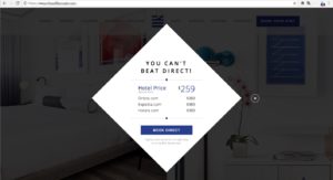
Check out this banner I was shown within five seconds of visiting a hotel website:
The fact that you offer better rates than the OTA’s should never be a full-screen popup for someone who is visiting your website for the first time. Instead, let them read your new and improved, content-filled homepage and see what you’re about before accosting them with an urgent message.
Who Has the Best Content?
A question that I get asked all the time is, “So who is doing travel content right?” I really wish I could say the name of one of the big hotel brands. They have been in the travel game for decades and their online content should probably be the best. Unfortunately, that’s not the case. A not so little startup founded in 2008 in San Francisco has the best travel content in the game. I am talking about, of course, Airbnb.
Hotels thrive when people travel. Shouldn’t hotel content be inspiring and encouraging people to travel? Shouldn’t your hotel take the lead in answering questions about your location and neighborhoods?
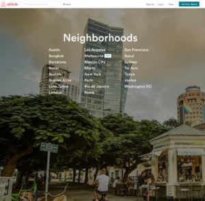
One of the best examples of travel content is the Airbnb neighborhood guide that was launched in 2012.
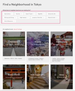
Not only do they have excellent content on these pages, but also give the pages extra credibility by adding advice from locals. They feature best-in-class writing with clear-cut titles. And they take the whole thing to a higher level by breaking down the attributes of each neighborhood, and even the moods you are likely to encounter in each location. Check out the killer segmentation matching travelers to their preferences:
You would think the big hotel brands would be all over this because they do have the bandwidth and franchise fee revenue to produce this stuff. Instead, we get office desks taken out of hotel rooms and are told to travel “brilliantly.”
Here’s another tip: people love maps! Adding curated maps with comments about different points of interest makes travel planning a breeze. It’s amazing what you can create with the Google Maps API. It’s in their header, folks: “Build the next generation of location experiences.”
And let’s not forget the quality of the photography being used on Airbnb pages. He is my version of the Friday night lights quote:
“Good content. Great photos. Can’t lose!”
– Vikram Singh
Too many hotels are waiting at the bottom of the funnel for revenue to trickle down. Great content is the perfect opportunity to feed the funnel and create demand. Instead of squeezing the life out of a “book direct and save” campaign, how about participating in the guest’s travel experience at a much earlier stage?
Conclusion
Good content is your competitive edge at a time when buying advertising is getting more and more expensive. With so many hotel and OTA websites competing on the web to attract travelers, content can be your salvation. If you have a content-poor, design-rich website, it is hurting your long-term revenue as well as your immediate conversions. On the other hand, the playing field is wide open for your hotel to start filling the travel-planning void. Inspiring and useful content will not only get you new business, but will also help you stand out in a crowd of mass-produced content-free websites. If you are not using content to capture the attention of people interested in your location, neighborhoods, and attractions…someone else will.


